Compass Monogram
Most classic and premium. Reads as navigation, judgment, and global orientation.
Brand exploration · visual directions
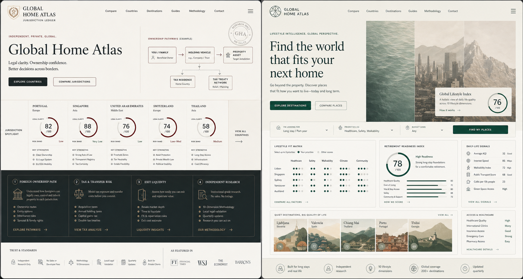
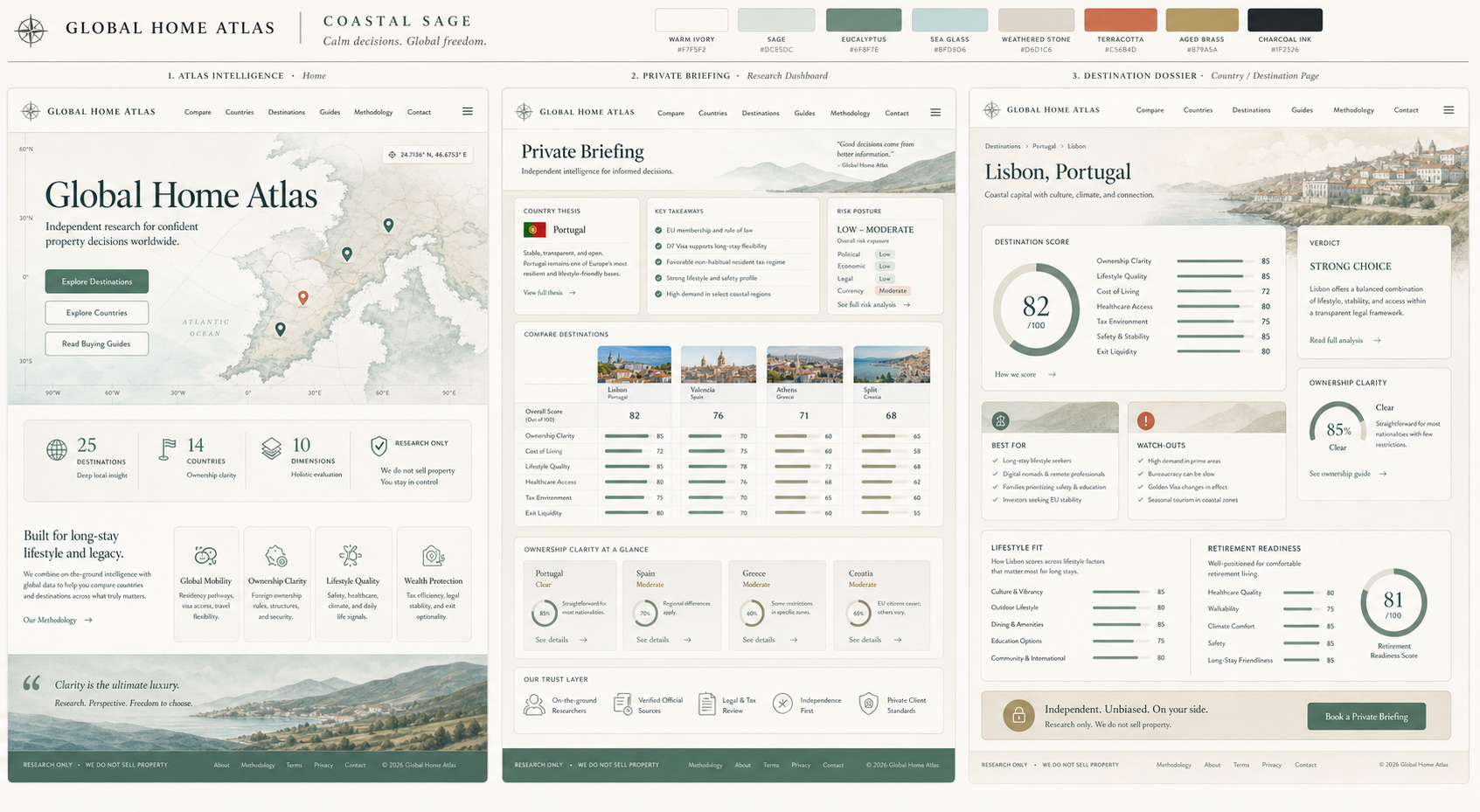
Three visual directions for the Global Home Atlas premium atlas, briefing, and destination dossier experience.
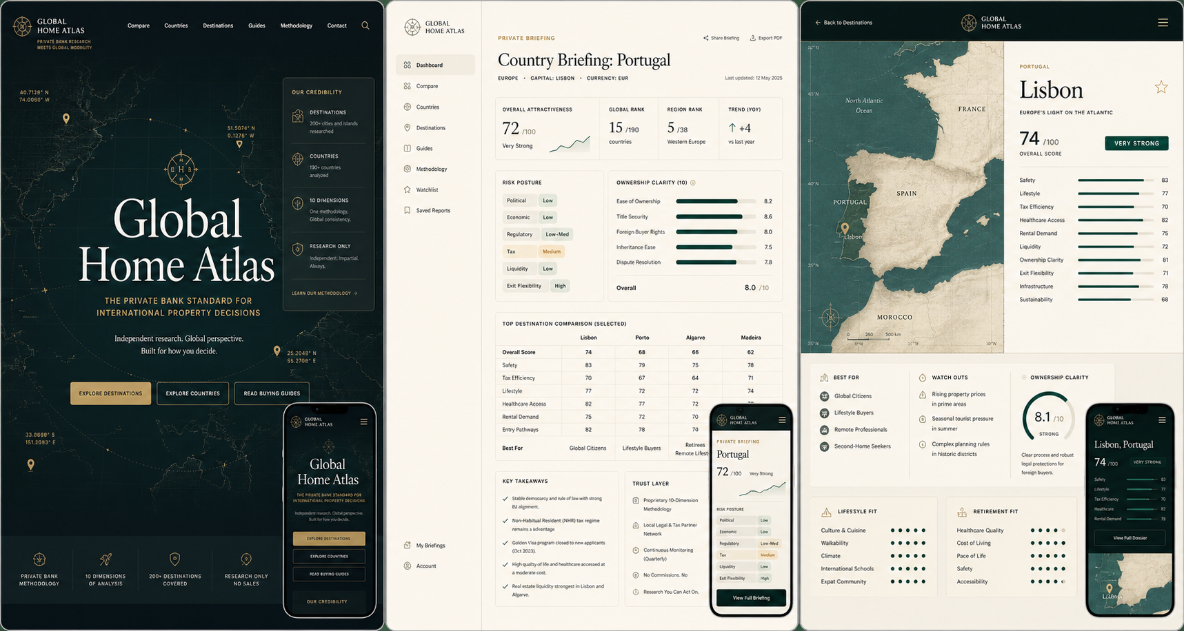
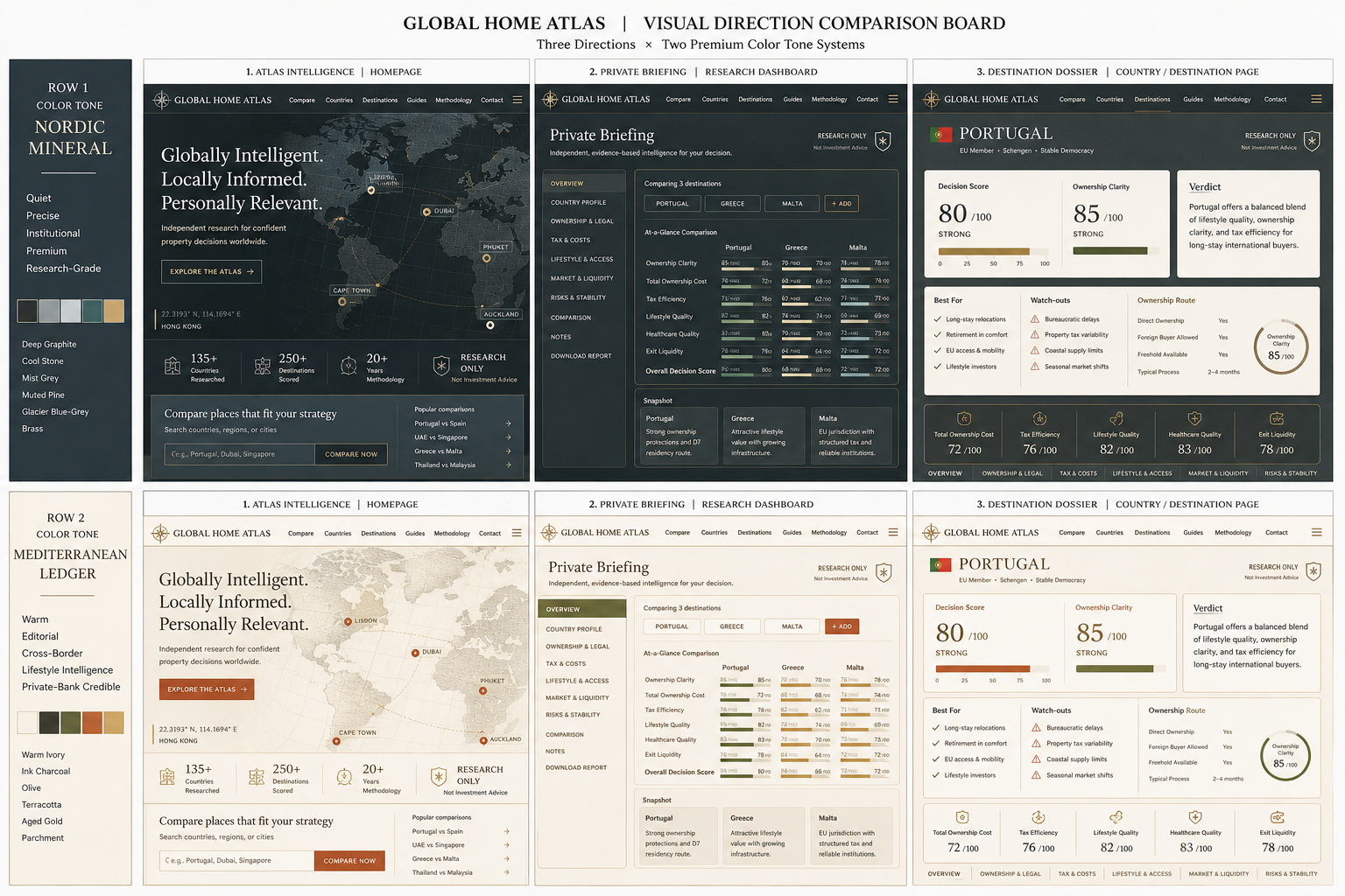
Best for homepage brand impact: dark cartography, coordinates, trust metrics, and premium decision framing.
Best for methodology, guide hubs, and comparison surfaces where density and credibility matter most.
Best for destination and country pages: verdicts, watch-outs, ownership clarity, score bars, and buyer-fit modules.
Best for making ownership clarity, legal structure, tax friction, and exit risk feel like the brand's core intelligence edge.
Best for adding emotional warmth while keeping the product grounded in long-stay fit, healthcare, access, and daily-life signals.
Cooler, quieter, and more institutional: graphite, stone, mist grey, muted pine, glacier blue-grey, and restrained brass.
Warmer and more editorial: ivory, ink charcoal, olive, muted terracotta, aged gold, and parchment neutrals.
Most relaxed and approachable: warm ivory, soft sage, eucalyptus, sea-glass blue, weathered stone, muted terracotta, aged brass, and charcoal ink.